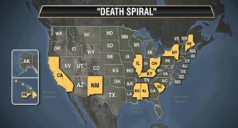
THE NEW WELFARE MAP
Quite an eye opener.
*
*
*
*
*

These 11 States now have More People on Welfare than they do Employed!
Last month, the Senate Budget Committee reports that in fiscal year 2011, between food stamps, housing support, child care, Medicaid and other benefits, the average U.S. household below the poverty line received $168.00 a day in government support. What’s the problem with that much support? Well, the median household income in America is just over $50,000, which averages out to $137.13 a day.
To put it another way, being on welfare now pays the equivalent of $30.00 an hour for a 40-hour week, while the average job pays $25.00 an hour.
AND YOU AND I ARE PAYING FOR IT!!!
Does this even remotely seem right??
